Ubiquity Repositories
Summary
Team: Warren Lai
Role: UX Researcher, Product Designer
Deliverables: Competitive analysis report, complete redesign of product across devices
Our goal was to create a SaaS institutional repository platform — where researchers/museums can preserve research files, artwork, etc. — that streamlined existing user flows and was more visually appealing than those on the market. Our user base was primarily repository managers and researchers who frequently used them; after learning about their needs, we added features such as intuitive filtering, author pages to showcase academics’ work, and a more modern look to the UI. After tweaking the design with testing results, it was well-received, and Ubiquity Press is now hosting repositories for the British Library and Pacific University, with others in the works.
Research
Competitive Analysis
On day one, we started off by researching 9 institutional repositories and other services catered to academics. We focused on general usability, industry standards, aesthetic value, pain points, and anything else that stood out to us.
We learned a lot from this, but the most salient points were:

Typographic hierarchy is a major weak point in most of the repository systems on the market. Pages often appeared cluttered and hard to navigate due to poor information architecture.

Repositories on the market did a good job at visually representing important sets of data, such as visitors by country, citation numbers for pages and authors, etc.
Interviews
We interviewed eight people in total, a mix of repository owners (i.e. clients) and repository users across the US and UK. From those, our most important insights was:

Most services don’t offer the opportunity to implement institution-specific branding, leading many to look and feel extremely similar and un-enticing. Branding was critical to promote trust in the content.

Both repository owners and repository users want easy and intuitive filters to narrow down the thousands of search results they may encounter while looking for a work.
Ideation & Iteration
User Flow
After conducting research, we decided to make a user flow to map out each part of a user’s journey and see where we could streamline the steps they would go through. We got a sense of what the two main flows we were to focus on — the search and explore flows — would look like, and now had an idea of what to start designing.
Low-Fidelity Sketching
Moving forward, we began to brainstorm more about the general structure of pages and what individual components would look like. Here are a few sketches from that stage:
Mid-Fidelity Iterating
Home Page
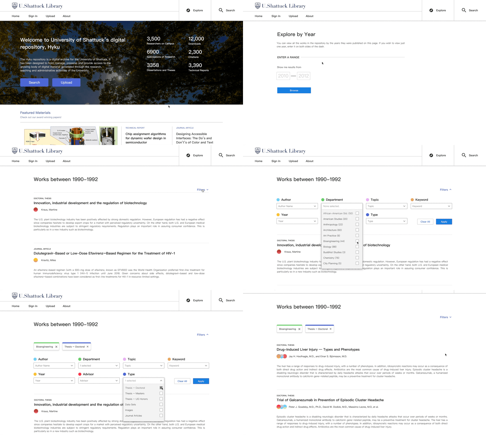
Primary Goals: welcome users to the repository, showcase featured and recent uploads, and display the impact of the institution’s research.
Search Results
Primary Goals: display the works and contributors to the repository in a clean way and allow users to filter results to find exactly what they want.
Explore Pages
Primary Goals: allow users to find works in a more general way than searching and allow clients to showcase their institutions’ collections.
Work Page
Primary Goals: display the necessary information (i.e. abstract, metadata) in a clear way, demonstrate the impact of a piece of research, and clearly organize call to action buttons.
Author Page
Primary Goals: give researchers a platform from which they can be discovered, present their impact metrics cleanly, and make it easy to find all the works by a particular author.
& On Multiple Screens
Another aspect of the project was making the platform compatible for mobile devices, such as phones and tablets. Warren took the lead on designing for an iPad-size screen while I focused on adapting our designs for iPhone screens: here are a couple of screens from the phone version.
Author Page
Work Page
Testing
As soon as we had a working prototype and were confident enough in the designs we had, we began incorporating user testing into our user research interviews as well. Here are some of our main findings:
Home Page
The lack of a search bar was jarring to some people — we made it a configurable option on the banner later on.
Visually, it looked too similar to a university home page. We revisited our previous insights and made it very clear that it was a repository by changing the images, copy, and logo.
Work Pages
Call to action buttons on the Article/Work Pages should be hypervisible. We changed the main button indicator from font color to box color after that.
ORCIDs, a unique ID provided to those who publish research to differentiate them from others with the same name, had a lot of room in the Article/Work Page. Users informed us that people will rarely copy and paste an ORCID, and that it doesn’t need a lot of real estate.
Author Pages
Author Pages as a concept were not universally warmly received. Some institutions such as museums do not have a need for it, whereas others are keen to hop on, so it’s now an option that one can enable/disable.
End Product
The Explore Flow
Screens
Reflections
I thoroughly enjoyed working at Ubiquity Press this summer and am really glad I had Warren as a partner for it. Though it was fun, it was also incredibly daunting to design the entire front-end of a website from scratch.
It was also apparent that research is not linear, and real design work doesn’t flow like a design challenge or sprint per se. You often run into road blocks, get competing feedback, don’t have contacts to learn from, etc., and have to work with what you can. It felt strange to start sketching without having talked to people first, but I think it ended up working alright, and it’s okay to incorporate new research insights into your designs as you go.
Our supervisors placed a strong emphasis on accessibility, so I feel that I learned a lot about it this summer. With regard to color, we always checked our combinations to ensure that they were legible and had sufficient contrast. We tried to keep the pages organized in a way that would allow those with screen magnifiers to sufficiently take in information and made buttons pretty large to accommodate those who may have trouble with it.
This isn’t entirely design-related, but rather work style-related; I realized that when you’re given a huge project like this, it’s really important to set smaller goals every day to avoid feeling paralyzed by how much there is to do. I also tried to make breaks creative! I used my journal to doodle instead of going on Instagram or Twitter to keep the juices flowin’ 🌊


